Why Small Businesses Must Have a Mobile-Friendly Website in 2025
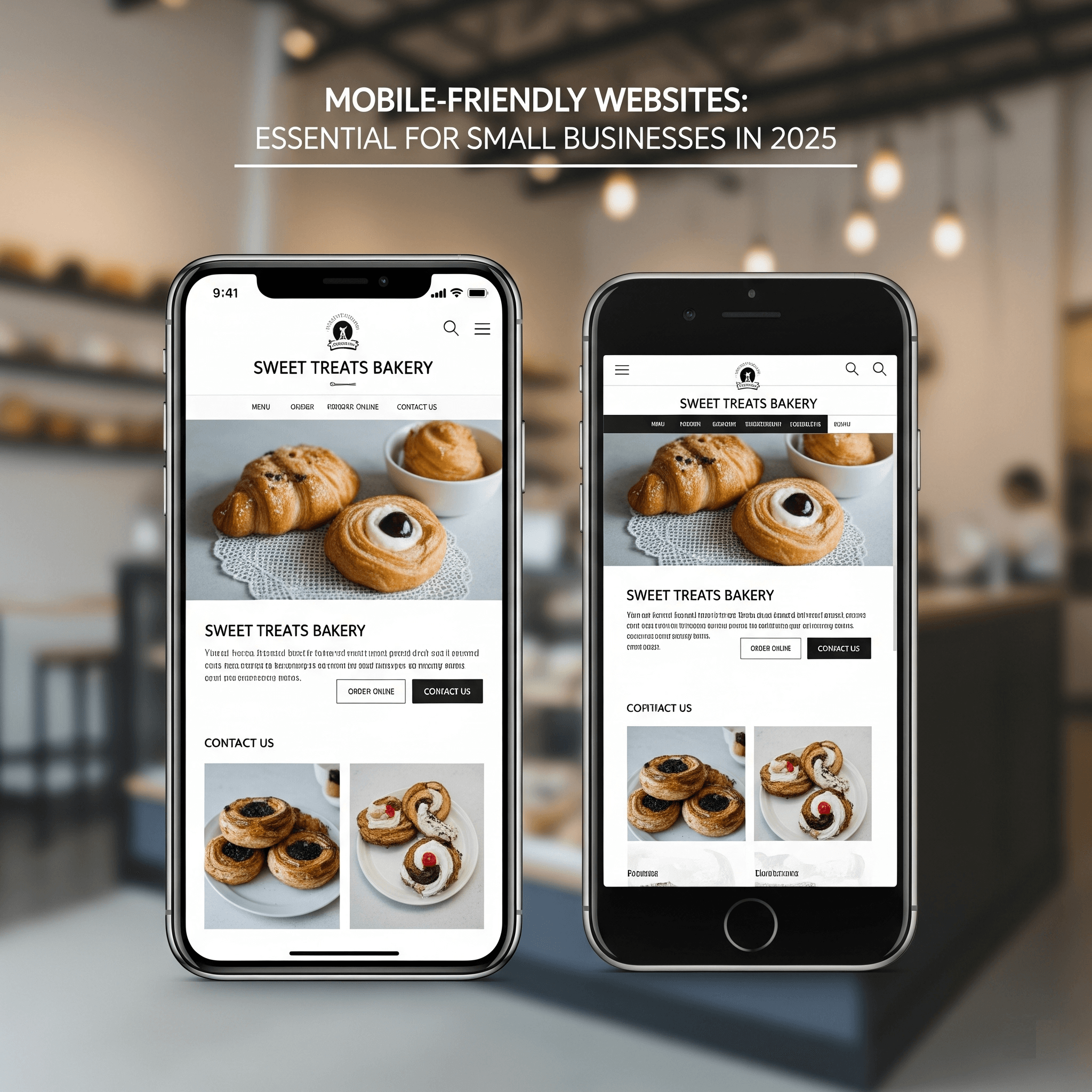
In 2025, having a strong online presence is not just a trend – it’s the lifeline of every small business. At the center of this presence is your website. However, the reality is that simply having a website is no longer sufficient. If your site doesn’t work flawlessly on smartphones, you’re losing customers every single day.
The world has shifted. Desktop computers are no longer the main access point to the internet. Today, billions of people – including your target customers in Indore, Madhya Pradesh, and across India – are browsing, shopping, and searching for services on their mobile phones.
Failing to cater to this mobile-first audience is like locking the door of your online shop for half your customers. Let’s break down why a mobile-friendly website is now an absolute must for your business in 2025:
1. Mobile Users Dominate Internet Traffic
People are constantly glued to their smartphones during commutes, while standing in queues, and even while relaxing at home. Studies show that mobile traffic forms the majority of web usage globally.
If your site doesn’t load properly on small screens, potential customers will instantly move to your competitors whose websites are easier to use.
2. Better User Experience = More Conversions
A mobile-optimized website ensures:
- Responsive Design: Your website seamlessly adapts to any screen dimension.
- Fast Loading Speed: Mobile users expect instant results.
- Simple Navigation: Menus, buttons, and content are easy to use on touchscreens.
- Touch-Friendly Layout: No need for zooming or clumsy scrolling – only seamless browsing.
When users enjoy their experience, they stay longer on your site and are far more likely to contact you or place an order.
3. Boost Your Local SEO Ranking
Most local searches – like “best salon near me” or “NGO website designer in Indore” – are done on mobile devices. Google ranks mobile-friendly websites higher in these searches.
If your site isn’t mobile-optimized, you’ll miss out on appearing in front of nearby customers who are actively looking for businesses like yours.
4. Easier Customer Actions = Higher Sales
Whether it’s booking an appointment, filling out a contact form, or buying a product, a mobile-friendly site simplifies everything. A clunky site, on the other hand, leads to abandoned carts, missed calls, and lost revenue.
5. Professional Look Builds Trust
Your website is often your first impression. A tidy, adaptable layout immediately communicates professionalism and trustworthiness. A poorly designed or outdated site can drive customers away before they even interact with your business.
6. Stay Ahead of Your Competition
Most of your competitors are already investing in mobile optimization. In 2025, it’s no longer optional – it’s the standard. Falling behind means losing valuable customers to businesses that are already mobile-ready.
Don’t Get Left Behind!
The shift to mobile is permanent. For small businesses in Indore and across India, a mobile-friendly website is now a basic requirement for growth, visibility, and survival in the digital world.
Prepared to turn your website into a mobile juggernaut?
Contact Web Desire Solutions today at www.webdesiresolutions.com and discover how we can help you succeed in the mobile-first era.
FAQs About Mobile-Friendly Websites
Q1: What does “mobile-friendly” mean?
It means your website automatically adjusts to different screen sizes (phones, tablets, etc.) so users can easily read and navigate without zooming or scrolling excessively.
Q2: How do I check if my site is mobile-friendly?
Open your website on your smartphone. If the text is too small, images don’t fit, or navigation is confusing, it’s not mobile-friendly. You can also use Google’s Mobile-Friendly Test tool to check.
Q3: Why is 2025 so critical?
Mobile usage now dominates internet traffic, and Google prioritizes mobile-optimized sites in search results. Without mobile readiness, you risk becoming invisible to customers online.
Q4: Will this help me get more customers?
Absolutely! Mobile-friendly sites reduce bounce rates, improve search rankings, and make it easier for visitors to contact or buy from you.
Q5: Is “mobile-friendly” the same as “responsive”?
Yes – responsive design is the best way to ensure your site looks and works well on any device.
Q6: How long does it take to make my website mobile-friendly?
It depends on your current site. A simple site may take a few days, while a full redesign might take longer, but the results are worth it.
Q7: My business is small – do I need this?
Yes! Small businesses depend heavily on local visibility and word-of-mouth. A mobile-friendly website ensures you’re discoverable when people search on their phones.